1 minute to 20 seconds – ATM cash withdrawal improvement
Designer Name: Ramon Shitta
Project Duration: 4 weeks
- Research and data collection – 1 week
- Wireframe and prototyping – 1 week
- Testing & Refining – 1 week
- Report writing – 1 week
Tools: Invision, Penpot
Role: UX Research, UI Design, Prototype testing
Background of the problem
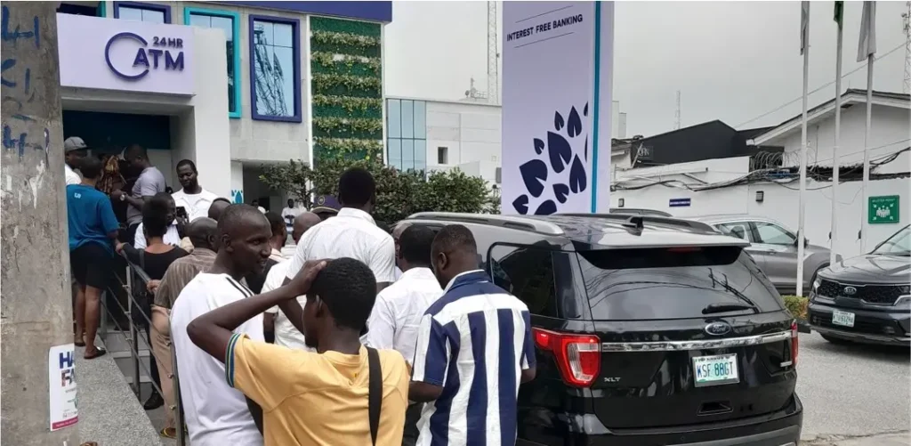
Nigeria changed three of its largest bills (N1000, N500, and N200) at the end of January 2023. As a country, we were only given about 2 months’ notice to bring all of the old notes to the banks. However now on the other side of the law, there’s been a scarcity of new notes and ATM lines have been extremely long. The network through which POS card transactions go through also has been unreliable. In a cash-heavy society that’s trying to go cashless, it becomes difficult.
Potential opportunity
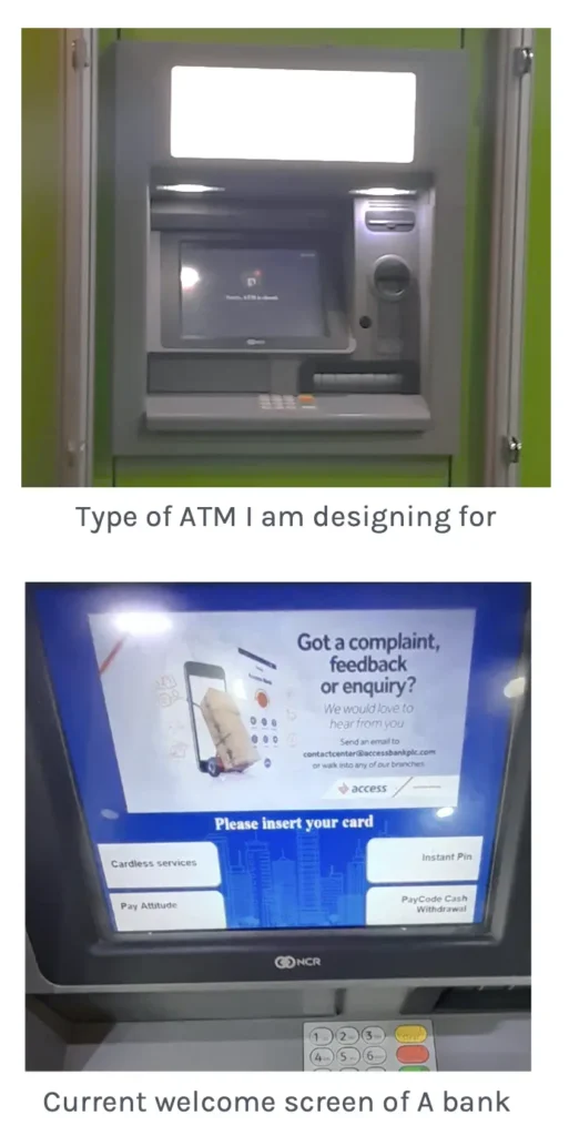
How might the design be able to improve the ATM withdrawal process to make it easier for users? To do this I chose Access bank (referred to as bank Smile bank in the prototype) because I use them the most for money withdrawals due to their proximity to my place of work and residence
Research & Analysis
The main question I had was “Is there a way to shorten the time taken to withdraw to 15 seconds?”
I conducted some research in 3 ways:
Question 1
How long does it take to withdraw money from the ATM? I got in a queue trying to withdraw money at one of the 8 banks on my road with cash. Based on this I was able to find out that it takes 1 – 4.5 minutes on average for a person to withdraw money. I went to another bank and they were 40 people in line which means that it would take me about 40 minutes – 3 hours to get the money from the ATM. If I’m able to shorten the time range to 15 seconds – 1 minute, that would mean the wait reduces to 10 minutes – 45 minutes.
Question 2
How do people feel about the ATM? I asked five people for their opinions, and these were their responses. Which I used to start designing:
- There’s no money in the ATM and it doesn’t tell you. Do you have to go through the whole process to then be disappointed?
- At times the ATM is not taking certain bank cards and it does not let you know. The ATM just spits out the card without any explanation.
- I don’t know why 6 ATMs are on when only 1 of them is actually working. If other ones are not working why aren’t they off? You now have to try 4 or 5 ATMs to find out which one is actually working.
- I don’t know why the queues move slowly! I was waiting for 30 minutes and we were like 7 people
- The ATM is only giving out N200 and they are not allowing more than N10,000 at a time.
Question 3
What is the current process? I timed myself and I was able to accomplish withdrawal in 1 minute. In order to find out why I took photos of the screens of the ATM and use that to make a map of the process flow for Smile bank.
Concepts & Sketches
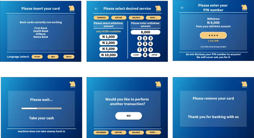
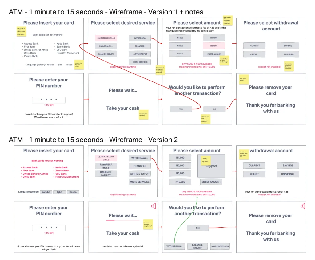
Based on the research done I started to create wireframes for the initial layouts of the screens after using the crazy eights method. I was able to bring out some of the research and turn it into a mid-fidelity prototype.
I did a simple usability test using myself twice as a user since I am a customer of the bank and based on that I made some notes for the 2nd version of the wireframe.
During the usability test, I learned that:
- There was no clear hierarchy between the sections on my screens
- I did not give options for users to get out of screens and go back if they made mistakes on some screens
- I was not consistent with my usage of language
- I did not realize font size affected reading time
- I realized they were opportunities to link already existing termination screens with new tasks that could be done
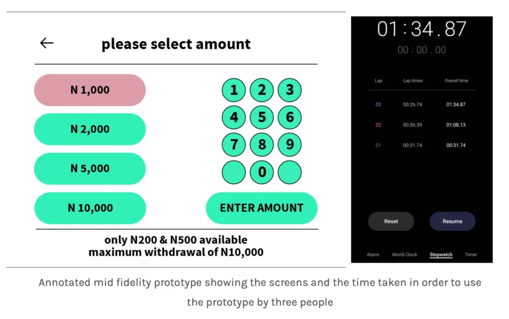
Mid Fidelity Prototype
The mid fidelity prototype came upon some issues after the testing. The main one was that the quickest time that could be taken to complete the task of withdrawing money was 26 seconds which is about double the target of 15 seconds. It became clear to me that while using the ATM about 8 seconds go towards putting your card in the machine, and the machine loading while it transitions between screens and taking your card back with your money. This means that they’re only about 7 seconds for the complete flow during which the user has to select what they would like to withdraw.
Design iteration
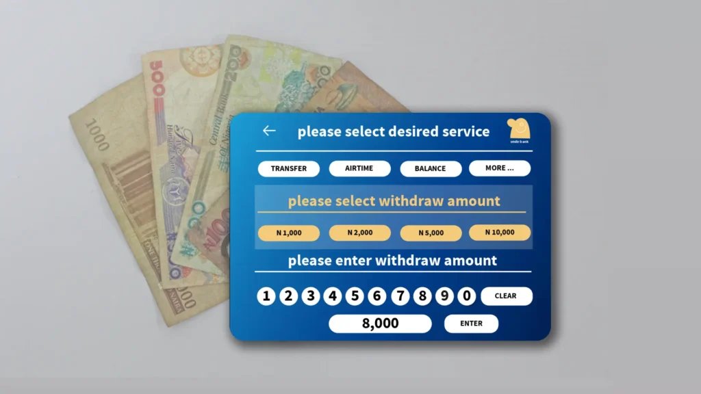
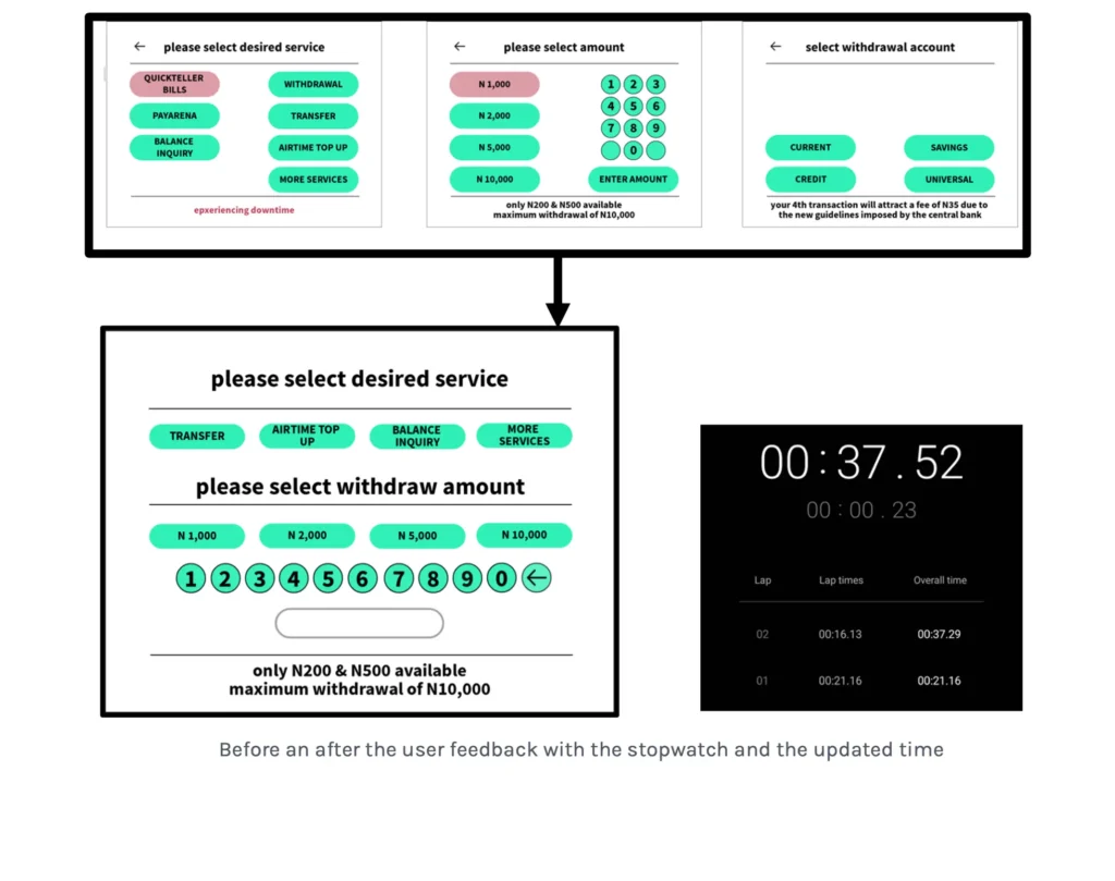
Keeping this in mind I did another design iteration and went back to the wireframe stage where I tried to ensure that it took 7 seconds to complete the whole withdrawal task. This meant I had to try to shrink almost all interactions to one page. The most significant change I was able to make was consolidating three screens into one using a conditional statement
User testing
For the pages shown on the right, using a stopwatch I was able to consolidate three frames into one considering time and here are the main changes that were made:
- The selection screen for service and the amount selection screen were joined into one.
- Instead of choosing the withdrawal account, this was made conditional to show only for people who have multiple accounts.
Feedback during the test:
“This is very interesting. Now that I’m using this I wonder why withdrawing money is so drawn out and not consolidated”.
Solution & Impact Overview
In a city like Lagos, Time is a very valuable resource because a lot of things are extremely unpredictable. Having a faster way of withdrawing money from the ATM increases the overall productivity of Nigerians and it makes commerce much easier as we still have many issues with the phone and banking that work with make cashless options difficult.
How long does it take to withdraw money from the ATM now?
Based on this test, it takes at minimum 20 seconds, below the target of 15 seconds; however, being able to shorten the wait by 2/3 reduces wait time from 1 hour to 20 minutes.
The next phase of research to be done would be involving UX writing and sizing of elements on the screen in order to make sure that they are easy to read. Because this is a product for almost anyone, more user research has to be done in order to be sure that some of the consolidations that were made are easy to follow.
